Be sure to cast your votes in the poll below; but first, let’s check out the box art designs themselves.
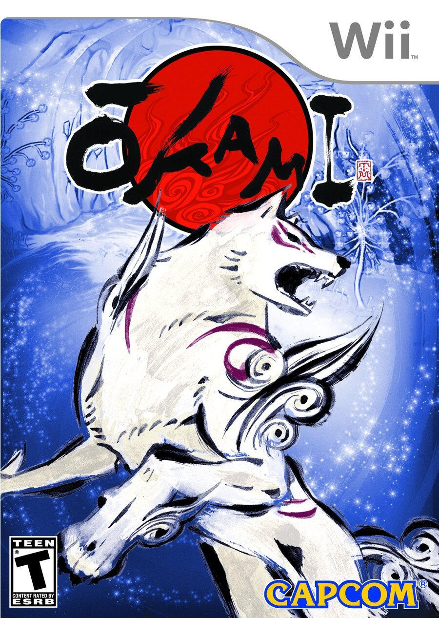
Europe / North America

The European and North American design is honestly pretty simple and to the point. Our wolfy protagonist stands front and centre, rearing up on its hind legs as if ready for action. The painterly aesthetic extends into the single-colour background too, with the blue forest contrasting the red of the logo. We’d be lying if we didn’t say that we find this one a little bit nice.
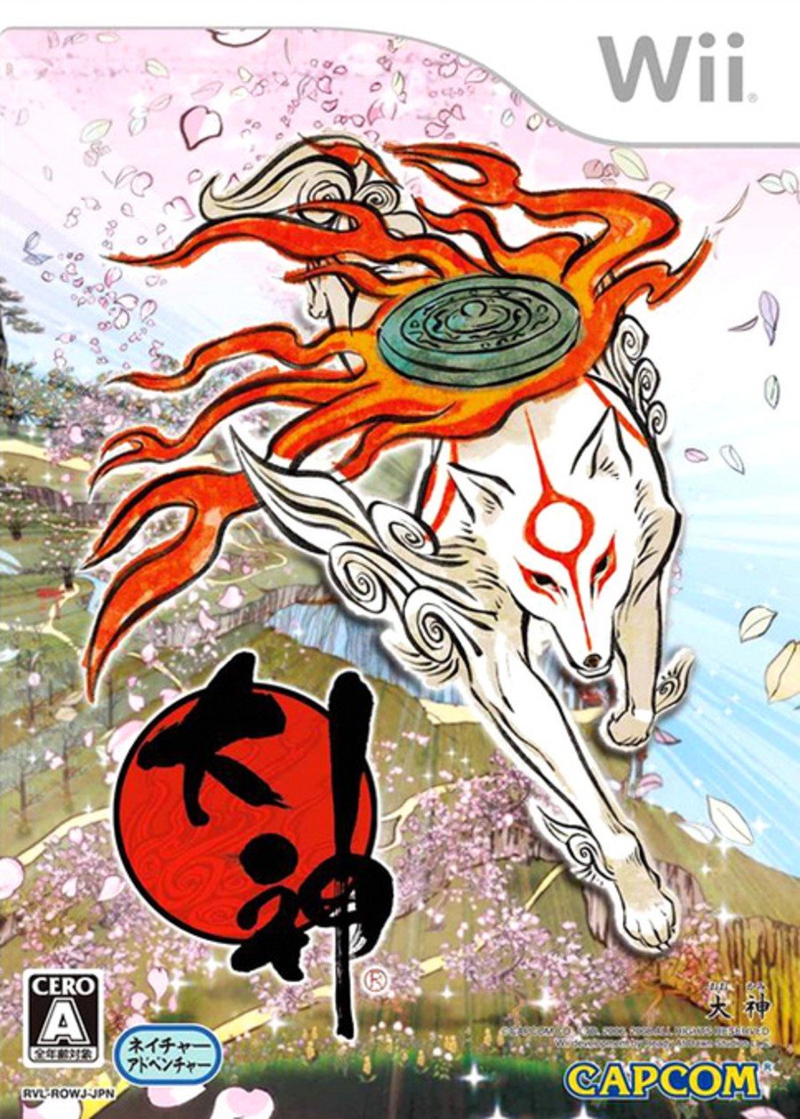
Japan

Woof. The Japanese design takes the game’s artistic sensibilities and dials it up to eleven. Amaterasu now runs towards us with a flaming reflector on its back. Bright pastoral colours extend over the left half of the box, while a pink cherry blossom peeks out in the background. It certainly has more going on, but gosh, isn’t it beautiful?
Thanks for voting! We’ll see you next time for another round of Box Art Brawl.

